Web Development
Try Using Your Website With Only a Keyboard. I Dare You.
Press Tab and watch what happens: invisible focus, menus you cannot close, buttons you cannot reach. A practical checklist for the things most front-end developers never test.
Accessibility often shows up at the end of a project, as an audit or a list of fixes. In my experience it works much better as a set of habits you apply while building. Most of the work is not exotic. It is about using the platform the way it was designed.
Start with semantic HTML
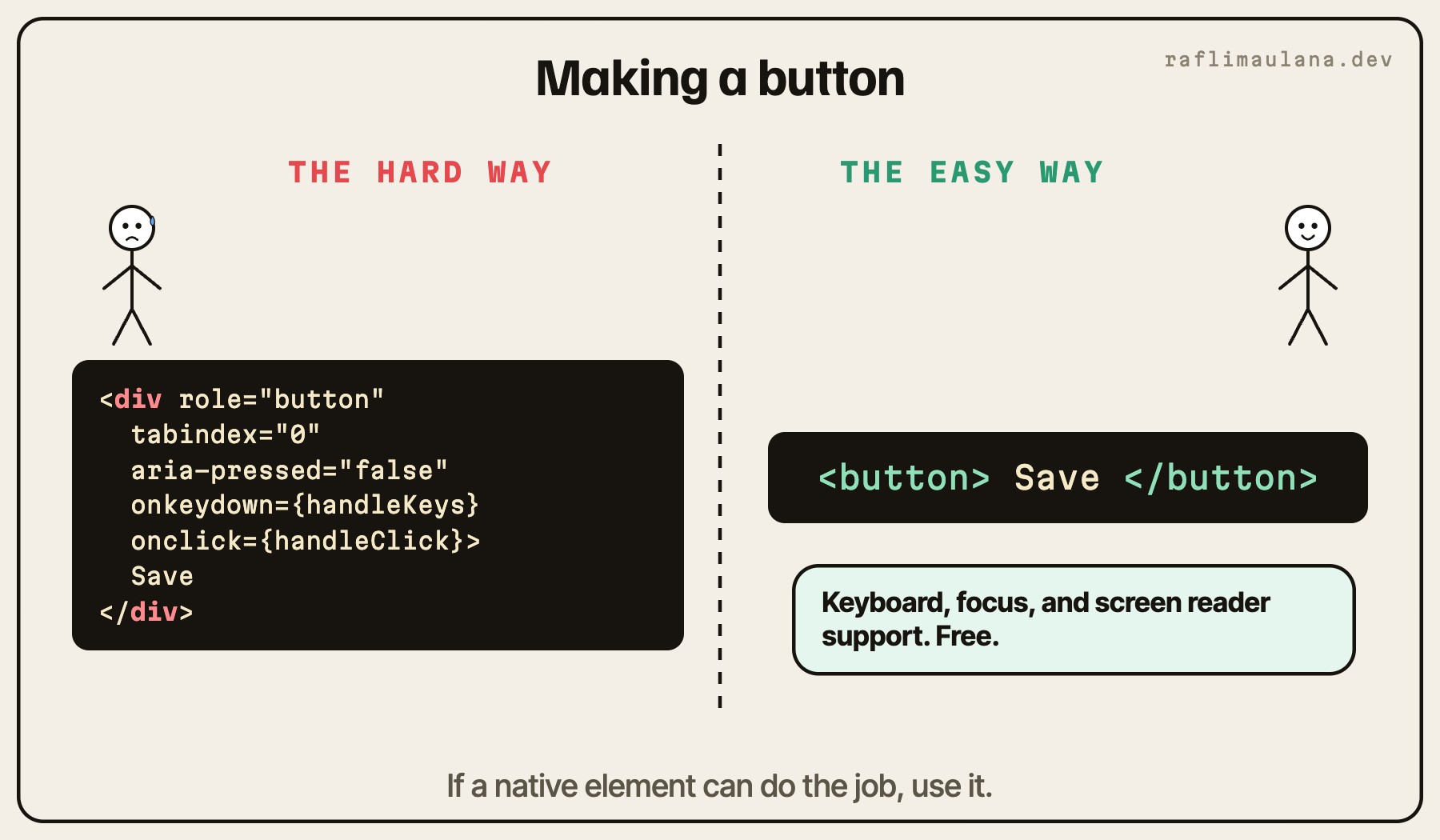
Native elements give you keyboard support, focus handling, and screen reader announcements for free. A button is focusable, responds to Enter and Space, and is announced as a button. A div with a click handler is none of those things until you rebuild them by hand.
Use
buttonfor actions andafor navigation.Give every page one
h1and keep heading levels in order.Wrap regions in
header,nav,main, andfooterso assistive tech can jump between them.
Make the keyboard path obvious
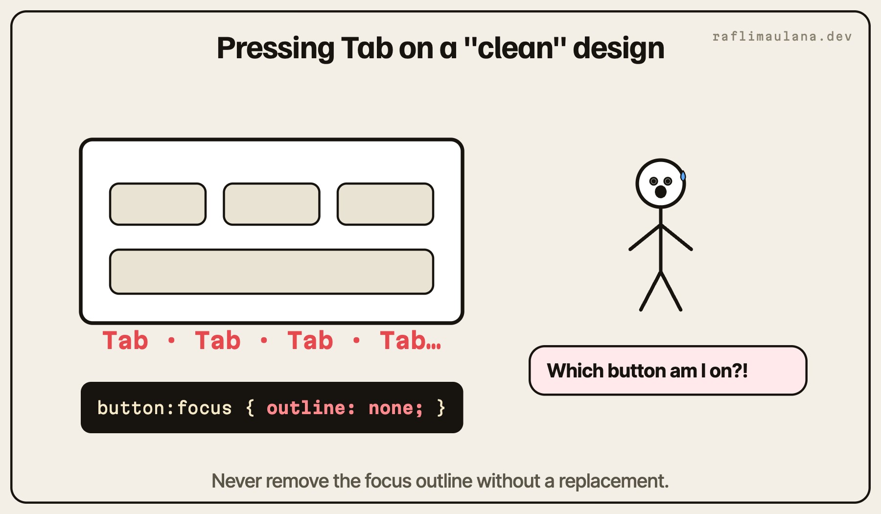
Try using your interface with only the Tab key. You will quickly find hidden traps: menus that cannot be closed, modals that let focus escape, custom dropdowns that never receive focus.
Keep a visible
:focus-visiblestyle. Never remove the outline without a replacement.Close overlays with Escape and return focus to the element that opened them.
Add a "Skip to content" link as the first focusable element.
Use ARIA to describe, not to fix
ARIA is powerful, but it only changes what assistive tech announces. It does not add behavior. Reach for it when native HTML cannot express the state, such as aria-expanded on a menu toggle or aria-current on the active page link.
If a native element can do the job, use it. ARIA is for describing state that HTML cannot.
Respect motion and media preferences
Animation makes interfaces feel alive, but it should never be required to understand content. Check prefers-reduced-motion and offer a calmer version. Give images meaningful alt text, or an empty one when they are purely decorative.
Make it part of the definition of done
The checks that stick are the ones built into the workflow:
Keyboard-only pass before every merge.
Lighthouse or axe check on key pages.
Real content, including long names and translations, in every design review.
Accessible interfaces are easier to use for everyone. They are also easier to maintain, because the structure is honest about what each element does.
Related articles
- Artificial Intelligence (AI)I Let AI Agents Write My Code. Here's Why It Didn't Turn Into a MessAn AI agent writes a first draft in minutes. Whether that becomes a speed-up or a mess depends on the workflow around it: a plan, the right context, structured prompts, and a real review.
- Web DevelopmentWhy Is Your Website Slow? It's Almost Always These 3 ThingsNo, you don't need a rewrite. Most slow pages share the same three problems: oversized images, fonts that block the text, and way too much JavaScript. Here is how I fix them.